Art can be read, and studied, from different perspectives and with different purposes. Arabic calligraphy is no exception to the rule.
Such is the case of Therry Fétiveau and his Batutah typeface.
His experience as a graphic and type designer literally opened a brave new world in front of my eyes: a world in which Arabic inscriptions are not only informative texts to be read and linked to a contextual dimension.
A world where the shape rules over the research of meaning.
And such a particular point of view naturally deserves a place here, as a reminder: the inscription is also aesthetic, not a mere medium to convey a message.
By Thierry Fétiveau, graphic and type designer.
In 2013, my colleague Mike Sabbagh and I were studying in the post-diploma in ESAD Amiens working on a Latin-Arabic typeface. Wishing to learn more about the richness of the Arabic-Muslim legacy, we made a one week study trip in Andalusia. A short trip, rich in discoveries.

First, it seems to me important to briefly explain the operation of the Arabic script. It uses an alphabet of 29 letters, it is devoid of capitals, common names and proper names are not particularly differentiated. It is a cursive writing is drawing from right to left; Letters may have up to four different forms depending on their position in the word: isolated, initial, medial or final. That said, six letters have only two forms (isolated and final) and they are not associated with next letter.

To create my Latin-Arabic character Batutah, I drew from various sources whatsoever Internet, books, museums and archives such as the University of Reading (England). I find it important to have a diversified research references as Paul Shaw advises in his article “Ten Simple Rules for Researching Letterforms”.
All these researches helped me in my work but I wanted to go further up to meet history in Andalusia. The beauty of Arabic calligraphy comes into its own when it covers palaces like the Alhambra in Granada.
For nearly eight centuries Andalusia was under Muslim rule (711-1492) and this architectural footprint is to be found in many buildings such as castles, palaces and mosques.
The first leg of our trip was the Alhambra in Granada, so named in reference to the Arabic word Al-Hamra’, “red” because of the colour of the hills of the region. The first buildings began under the Nasrid dynasty in 1232 and continued progressively through generations. The Alhambra is therefore not a fortress but a palace complex, comprising gardens and buildings where people lived.

The palatine chambers are profusely decorated, often from floor to ceiling, without any empty space, decoration being used to show both the power of the sovereign and his devotion.
Above, etching stucco phrase in a style akin to the Maghribi style, characteristic of the Maghreb and Spain. This calligraphic style with a blunt reed and letters are placed on a horizontal imaginary line. There are many variations depending on the region.
The phrase “There is no victor but Allah” becomes the repeating pattern on a wall frieze. Many inscriptions of Alhambra has been made in stucco from wooden molds in order to repeat many times some items. What is fascinating is that the walls of these palaces were a source of almost inexhaustible inspiration for my practice patterns and Arabic typography.

Transposition in modern typesetting. Image courtesy of Thierry Fétiveau.
Our second stage was Cordoba.
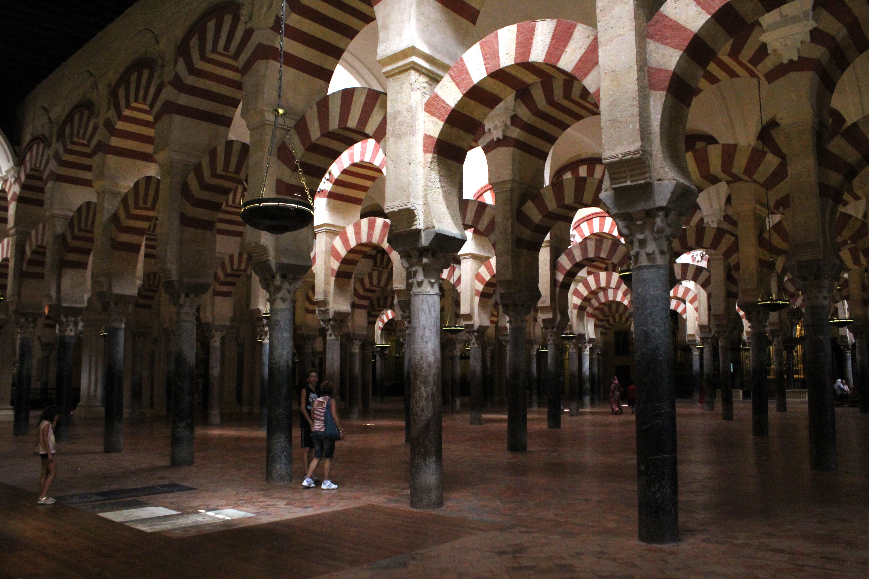
The Mosque-Cathedral of Cordoba has a stunning story. In 584, the Visigoths built on the site of a former Roman Temple the Church of St. Vincent Martyr. In 786 Abd al-Rahman I launched the construction of a mosque that will be continued by his successors. After its completion, the mosque spread over 850 columns on 23,000 m2.
After the Spanish Reconsuista 1236, Ferdinand III king of Castile built the city’s cathedral in the middle of the old mosque.
This story offers the visitors a unique example where the Umayyad style of Spain mixes with the Renaissance and European Baroque styles.

While the walls of the Alhambra are covered in a style resembling the Maghribi, with curves and round endings; in the Mosque of Cordoba, this is different. Here, inscriptions that are in the Kufic style, a much more dense and angular shape with quite high ascenders and a fairly geometric appearance. This style was born around the 7th century and has continued under the Umayyads and following dynasties, its use declining only around the 13th century. Again, many variations of this style exist.

It is obvious that this Andalusian trip also brought me much knowledge as graphic and type designer. This trip allowed me to know more calligraphy, artworks and Muslim architecture. These human achievements, more than 1000 years old, are still an almost inexhaustible source of inspiration. I invite you to sometimes barter your computer against a camera and a flight ticket. Have a nice trip to all.
About the author
Thierry Fétiveau is a freelance graphic and type designer based in France. He works both nationally and internationally for large groups or smaller structures. His specialty is the creation of lettering and typefaces; he also works in visual identity, scenography or edition. During his studies in ESAD Amiens, he designed a Latin-Arabic typeface still in process called Batutah as a tribute to the great traveler Ibn Batutah.
All the photos and images used in the article are courtesy of Thierry Fétiveau.

Truly inspirational……….
LikeLike
Very intersting !
LikeLike